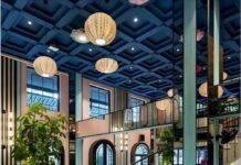
New Delhi, March 12,2014: Asian Paints launched ColourNext 2014, a research based annual trend forecasting initiative, which predicts the colours that are likely to have the most influence on Indian interiors this year. The colours predicted for 2014 fall under four broad themes called Plate Up, Steel Magnolia, CoExplore and Infinity.
Currently in its 11th year, ColourNext is the outcome of extensive research spread over six months involving over 100 designers and multi-disciplinary experts from across India studying societal, lifestyle and design trends. This year Asian Paints has tied up with five leading designers including – Sahil Bagga, & Sarthak Sengupta, Nuru Karim, Ritu Nanda and Alex Davis, who will be interpreting the themes and colour palettes of ColourNext 2014. They will be representing the trends through design spaces.
Commenting on the initiative, Amit Syngle, President – Technology, Sales & Marketing, Asian Paints said: “ColourNext 2014 is the outcome of a journey across India to gauge changing dynamics of consumer behavior that define a décor direction. Today, ColourNext is probably one of the most comprehensive trend researches done in the area of colour. The uniqueness of the entire process stems from the fact that thought leaders, from varied disciplines, come together to articulate the trends and colour palettes.”
“The genesis of ColourNext goes way back to 2002 when as a company dealing with colours, we realised that there was no India-centric colour forecast. It was this quest of looking at Indian trends and colours to give direction to the design community in India, which led us to create the first colour forecast. Asian Paints is now in the 11thyear of ColourNext and growing stronger every year.”
The ColourNext research process has been refined and polished to result in themes that closely resonate and align with India’s changing visage. Experts from varied fields of design including interiors, architecture, fashion, product and art, put together a large set of possible design themes for the coming year along with Asian Paints and their research partner Center for Knowledge Studies. A panel comprising style and design leaders curate this into the most promising four themes and colour palettes for India.
The four themes for ColourNext2014:
Plate Up:
Food is the latest obsession, where chefs are the new rock stars and the kitchen is where the party is. This vibrant world is finding design resonance in the rest of the home too, livening it up with vibrant colours which include rich plum, leafy green and popping reds. Shades like ingredients blend and complement each other to form a beautiful, eye-catching and savory colour recipe.
Steel Magnolia:
Soft meets strong in today’s woman and in her exists a perfect balance between determination and poise, self- assuredness and composure. At ease with herself and the world, she occupies all her spaces with aplomb, every detail and corner infused with her calm energy and her unique feminine spirit. The Magnolia palette comprises summery shades that exude youth and feminity partnering with deeper and richer hues. Thus warm peach and yellows recall the morning sun and pale blues are given definition by intense violet, dusky grey and dynamic rose. This is a finely balanced palette of translucence, delicacy, richness and maturity.
Infinity:
People are eager to share thoughts, inspiring and motivating each other, drawing strength from one another to give life to dreams dreamt together. This world is reflected in an eclectic and inspired design language where the imagination flies and playful flourishes come together in complete harmony. Drama, mystery and vastness are the key notes of this modern palette, expressed in cool and deep shades contrasting intensely with fiery tones of orange, red and gold.
Co-Explore:
This is a strong, modern, confident scheme of over lapping, juxtaposed elements in which richness, depth and density increase with every added layer. It is a palette of harmony, where individual tones collaborate to form a dynamic whole. Shades of yellows and greens merge to form depth and intensity. BWI


